
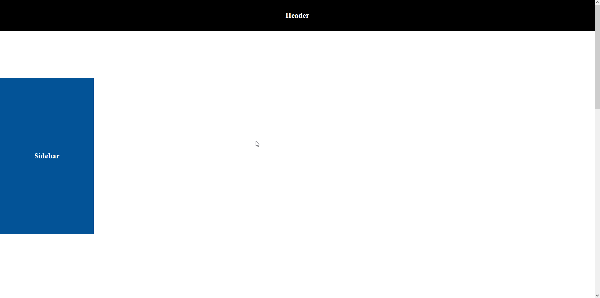
In this article, I will show you how to create sticky sidebar during scrolling between header & footer using jQuery? It is very useful to show special or important content to your users.
You have probably seen this trick used before with social icons or a sidebar that sticks to the top of your screen as you scroll down the page.
The problem is that often they do not stop scrolling and up either disappearing behind another element or overlapping something they should not, which looks cheap and unprofessional.
In this tutorial, we will create the ‘sticky element’ that only scrolls until the maximum height of its parent element which will prevent that unsightly overflow.
HTML Code:
<!DOCTYPE html>
<html>
<head>
  <meta charset="utf-8">
  <title>Popup</title>
</head>
<body>
  <header>
    <h2>Header</h2>
  </header>
  <section>
    <div class="sidebar"><h2>Sidebar</h2></div>
  </section>

  <footer>
    <h2>Footer</h2>
  </footer>
</body>
</html>
At this stage, it leaves a lot to the imagination in terms of design but it’s sufficient for the tutorial.
CSS Code:
<style type="text/css">
  body {
    padding: 0;
    margin: 0;
  }
  h2 {
    color: #fff;
    margin: 0;
  }
  header {
    display: flex;
    justify-content: center;
    align-items: center;
    position: fixed;
    top: 0;
    left: 0;
    background-color: #000;
    height: 100px;
    width: 100%;
    z-index: 9999;
  }
  section {
    position: relative;
    height: 2000px;
  }
  .sidebar {
    display: flex;
    justify-content: center;
    align-items: center;
    background-color: #035397;
    position: relative;
    top: 250px;
    left: 0;
    width: 300px;
    height: 500px;
  }
  .sidebar-sticky {
    position: fixed;
    top: 150px;
  }
  .sidebar-sticky-none {
    top: auto;
    bottom: 0;
    position: absolute;
  }
  footer {
    display: flex;
    justify-content: center;
    align-items: center;
    background-color: #000;
    height: 500px;
    margin-top: 50px;
  }
</style>
Our aim is to stick the blue part with the page scroll but to move it before it collides with the footer.
We will do this using the JQuery so we will write the jQuery script for it.
The first step is to set up the basic JQuery structure with the initial variables:
The second step is to work out what the maximum and minimum scroll limits are for the left sidebar.
For example, how far can you scroll down or up before it has to stop?
Getting the minimum is easy, you just need to take its sidebar’s top offset and add it to the elements CSS top.
The bottom is slightly more complex.
You need to take the sidebar’s top offset, add it to the sidebar’s height, then take away the window height and 2x the sidebar’s CSS top.
jQuery Code:
$( document ).ready( function(){
  var sidebarTopPos = $('.sidebar').offset().top - $('header').height() - 50;
  var footerTopPos = $('footer').offset().top - $('header').height() - $('.sidebar').height() - 50;
  $(window).scroll(function () {
    var scrollPos = $(this).scrollTop();
    if ( scrollPos >= sidebarTopPos ) {
      $('.sidebar').addClass('sidebar-sticky');
    }else{
      $('.sidebar').removeClass('sidebar-sticky');
    }
    if ( scrollPos >= footerTopPos ) {
      $('.sidebar').removeClass('sidebar-sticky');
      $('.sidebar').addClass('sidebar-sticky-none');
    }else{
      $('.sidebar').removeClass('sidebar-sticky-none');
    }
  });
});
Demo:
<!DOCTYPE html>
<html>
<head>
  <meta charset="utf-8">
  <title>Popup</title>
  <script src="https://code.jquery.com/jquery-3.6.0.min.js"></script>
  <script type="text/javascript">
  $( document ).ready( function(){
    var sidebarTopPos = $('.sidebar').offset().top - $('header').height() - 50;
    var footerTopPos = $('footer').offset().top - $('header').height() - $('.sidebar').height() - 50;
    $(window).scroll(function () {
          var scrollPos = $(this).scrollTop();
         	if ( scrollPos >= sidebarTopPos ) {
             	$('.sidebar').addClass('sidebar-sticky');
          }else{
          	$('.sidebar').removeClass('sidebar-sticky');
          }
          if ( scrollPos >= footerTopPos ) {
             	$('.sidebar').removeClass('sidebar-sticky');
             	$('.sidebar').addClass('sidebar-sticky-none');
          }else{
          	$('.sidebar').removeClass('sidebar-sticky-none');
          }
      });
  });
  </script>
  <style type="text/css">
  body {
    padding: 0;
    margin: 0;
  }
  h2 {
    color: #fff;
    margin: 0;
  }
  header {
    display: flex;
    justify-content: center;
    align-items: center;
    position: fixed;
    top: 0;
    left: 0;
    background-color: #000;
    height: 100px;
    width: 100%;
    z-index: 9999;
  }
  section {
    position: relative;
    height: 2000px;
  }
  .sidebar {
    display: flex;
    justify-content: center;
    align-items: center;
    background-color: #035397;
    position: relative;
    top: 250px;
    left: 0;
    width: 300px;
    height: 500px;
  }
  .sidebar-sticky {
    position: fixed;
    top: 150px;
  }
  .sidebar-sticky-none {
    top: auto;
    bottom: 0;
    position: absolute;
  }
  footer {
    display: flex;
    justify-content: center;
    align-items: center;
    background-color: #000;
    height: 500px;
    margin-top: 50px;
  }
  </style>
</head>
<body>
  <header>
    <h2>Header</h2>
  </header>
  <section>
    <div class="sidebar"><h2>Sidebar</h2></div>
  </section>
  <footer>
    <h2>Footer</h2>
  </footer>
</body>
</html>
Output: