
Here is a simple example of an animated spinner that features multiple bouncing ping pong balls making a circle with 360-degree animation using HTML and CSS:
HTML:
<div class="spinner">
<div class="ball ball1"></div>
<div class="ball ball2"></div>
<div class="ball ball3"></div>
<div class="ball ball4"></div>
</div>
CSS:
.spinner {
  display: flex;
  justify-content: center;
  align-items: center;
  height: 100vh;
}

.ball {
  width: 40px;
  height: 40px;
  border-radius: 50%;
  background-color: #48AFF0;
  animation: bouncing 1s linear infinite;
}

@keyframes bouncing {
  0% {
    transform: translateY(0);
  }
  50% {
    transform: translateY(-20px);
  }
  100% {
    transform: translateY(0);
  }
}

.ball1 {
  animation-delay: 0.2s;
}

.ball2 {
  animation-delay: 0.4s;
}

.ball3 {
  animation-delay: 0.6s;
}

.ball4 {
  animation-delay: 0.8s;
}
Output :
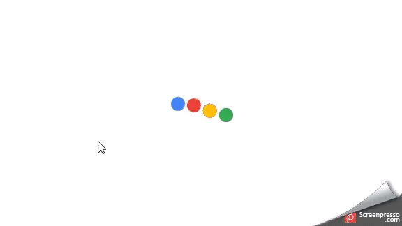
In this example, we use a div with the class “spinner” as a container for our balls. Each ball is represented by a div with its own class, such as “ball1”. We use the CSS “animation” property to create a bouncing effect for each ball, and the “animation-delay” property to stagger the animation of each ball. To make the balls form a circle, you can experiment with transforms, such as rotations, and adjust the number of balls as needed. You can also change the colors and sizes of the balls and the background to match your desired design.
Thanks for reading. Leave comments for suggestions or queries.