
Hello, Guys in this article we will be exploring how can we make rotating 3d dice using html, css.
1.HTML :
<!DOCTYPE html>
<html>
  <head>
    <title>3D Stunning Animation</title>
  </head>
  <body>
    <div class="container">
      <div class="box">
        <div class="side side1">1</div>
        <div class="side side2">2</div>
        <div class="side side3">3</div>
        <div class="side side4">4</div>
        <div class="side side5">5</div>
         <div class="side side6">6</div>
      </div>
    </div>
  </body>
</html>
2. CSS
<style>
      body {
        margin: 0;
        padding: 0;
        perspective: 1000px;
        background: #2e2e2e;
      }
      .container {
        width: 100%;
        height: 100vh;
        display: flex;
        justify-content: center;
        align-items: center;
        transform-style: preserve-3d;
        animation: rotate 10s linear infinite;
      }
      .box {
        width: 100px;
        height: 100px;
        position: relative;
        transform-style: preserve-3d;
        animation: rotate 10s linear infinite;
      }
      .box .side {
        position: absolute;
        width: 100%;
        height: 100%;
        border: 2px solid #000;
        box-sizing: border-box;
        background: #f7f7f7;
        display: flex;
        justify-content: center;
        align-items: center;
        font-size: 36px;
        font-weight: bold;
        color: #000;
      }
      .box .side1 {
        transform: rotateX(90deg) translateZ(50px);
         background:#ff595e;
      }
      .box .side2 {
        transform: rotateX(-90deg) translateZ(50px);
        color:#000;
        background:#ffca3a;
      }
      .box .side3 {
        transform: rotateY(90deg) translateZ(50px);
        color:'blue';
          background:#8ac926;
      }
      .box .side4 {
        transform: rotateY(-90deg) translateZ(50px);
          background:#1982c4;
      }
      .box .side5 {
        transform: translateZ(-50px);
          background:#6f1d1b;
      }
       .box .side6 {
        transform: translateZ(50px);
          background:#6a4c93;
      }
      @keyframes rotate {
        0% {
          transform: rotateX(0) rotateY(0);
        }
        100% {
          transform: rotateX(360deg) rotateY(360deg);
        }
      }
    </style>
Output :
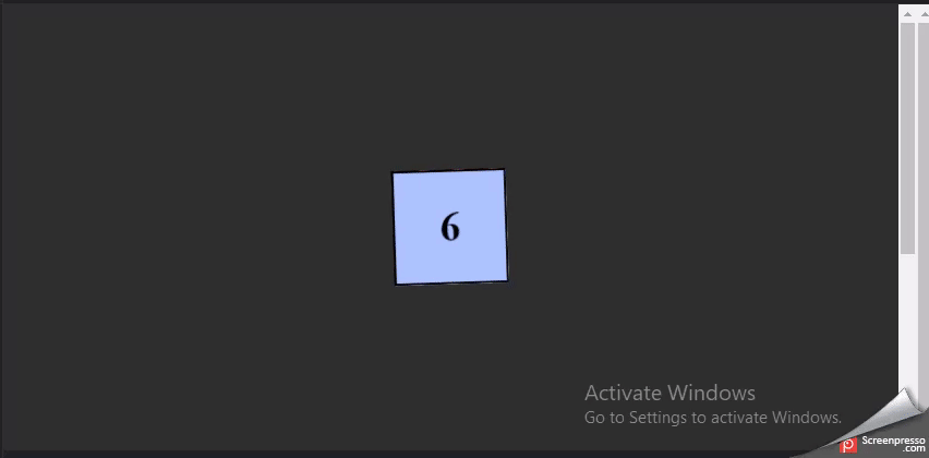
Hope you find it useful. also, you can give it a better look also put dots inside the HTML code to make it exact dice.
Leave comments, Suggestions are welcomed.
Thanks for reading.