
Introduction
In this post, we will see how to make an animated navigation menu using normal HTML, CSS, and javascript.
we are going to create a navigation menu that looks like this:

Let us start.
Step 1: Make one folder on your computer and open it into visual studio code
Here I make one folder named “navigation-bar” and open it into visual studio code and also make two files named “Navigation.html” for our HTML code and “style.css” for our CSS code and we write our javascript code into our HTML file in this folder.

Step 2: Now we are going to write our HTML code
<!DOCTYPE html>
<html lang="en">

<head>
    <!-- <meta charset="UTF-8">
    <meta http-equiv="X-UA-Compatible" content="IE=edge">
    <meta name="viewport" content="width=device-width, initial-scale=1.0"> -->
    <title>Navigation Menu</title>
    <link href='/style.css' type="text/css" rel='stylesheet'>
</head>

<body>

    <div class="navigation">
        <ul>
            <li class="list">
                <a href="#">
                    <span class="icon">
                        <ion-icon name="home-outline"></ion-icon>
                    </span>
                    <span class="text"> Home </span>
                </a>
            </li>
            <li class="list">
                <a href="#">
                    <span class="icon">
                        <ion-icon name="person-outline"></ion-icon>
                    </span>
                    <span class="text"> Profile </span>
                </a>
            </li>
            <li class="list">
                <a href="#">
                    <span class="icon">
                        <ion-icon name="chatbubble-outline"></ion-icon>
                    </span>
                    <span class="text"> Message </span>
                </a>
            </li>
            <li class="list">
                <a href="#">
                    <span class="icon">
                        <ion-icon name="camera-outline"></ion-icon>
                    </span>
                    <span class="text"> Photo </span>
                </a>
            </li>
            <li class="list">
                <a href="#">
                    <span class="icon">
                        <ion-icon name="settings-outline"></ion-icon>
                    </span>
                    <span class="text"> Settings </span>
                </a>
            </li>
            <div class="indicator">

            </div>
        </ul>

    </div>

    <script type="module" src="https://unpkg.com/ionicons@5.5.2/dist/ionicons/ionicons.esm.js"></script>
    <script nomodule src="https://unpkg.com/ionicons@5.5.2/dist/ionicons/ionicons.js"></script>
</body>

</html>
Copy above and paste it into your HTML file
we add our CSS file in your HTML code using the link tag in our head section and we also add two js files for icons who used in our navigation bar like home settings user and etc
Here are that two files :
- 1.<script type=”module” src=”https://unpkg.com/ionicons@5.5.2/dist/ionicons/ionicons.esm.js”></script>
- 2.<script nomodule src=”https://unpkg.com/ionicons@5.5.2/dist/ionicons/ionicons.js”></script>
Now out HTML looks like this in the browser:

Step 3: Now we add our CSS to the page and make it beautiful
@import url("https://fonts.googleapis.com/css?family=Poppins:100,200,300,400,500,600,700,900");

* {
    margin: 0;
    padding: 0;
    box-sizing: border-box;
    font-family: "Poppins", sans-serif;
}

:root {
    --clr: #222327;
}
body {
    display: flex;
    justify-content: center;
    align-items: center;
    min-height: 100vh;
    background-color: var(--clr);
}

.navigation {
    position: relative;
    width: 400px;
    height: 70px;
    background: #fff;
    display: flex;
    justify-content: center;
    align-items: center;
    border-radius: 10px;
}
.navigation ul {
    display: flex;
    width: 350px;
}

.navigation ul li {
    position: relative;
    list-style: none;
    width: 70px;
    height: 70px;
    z-index: 1;
}

.navigation ul li a {
    position: relative;
    display: flex;
    justify-content: center;
    align-items: center;
    flex-direction: column;
    width: 100%;
    text-align: center;
    font-weight: 500;
}

.navigation ul li a .icon {
    position: relative;
    display: block;
    line-height: 75px;
    font-size: 1.5em;
    text-align: center;
    transition: 0.5s;
    color: var(--clr);
}

.navigation ul li.active a .icon {
    transform: translateY(-32px);
}

.navigation ul li a .text {
    position: absolute;
    color: var(--clr);
    font-weight: 400;
    font-size: 0.75em;
    letter-spacing: 0.05em;
    transition: 0.5s;
    opacity: 0;
    transform: translateY(20px);
}

.navigation ul li.active a .text{
    opacity: 1;
    transform: translateY(10px);
}

.indicator{
    position: absolute;
    top: -50%;
    width: 70px;
    height: 70px;
    border-radius: 50%;
    background-color: #00e4ff;
    border: 6px solid var(--clr);
    transition: 0.5s;
}

.indicator::before{
    content: '';
    position: absolute;
    top:50%;
    left: -22px;
    width: 20px;
    height: 20px;
    background-color: transparent;
    border-top-right-radius: 20px;
    box-shadow: 1px -10px 0 0 var(--clr);
}

.indicator::after{
    content: '';
    position: absolute;
    top:50%;
    right: -22px;
    width: 20px;
    height: 20px;
    background-color: transparent;
    border-top-left-radius: 20px;
    box-shadow: -1px -10px 0 0 var(--clr);
}
Copy the above code and paste it into your CSS file
Now our page looks like this:

Now we are going to make animation using CSS without using keyframe properties:
Step 4: add the below javascript code into your HTML file
<script>
    const list = document.querySelectorAll('.list');
    function activeLink() {
        list.forEach((item) => {
            item.classList.remove('active');
            this.classList.add('active');
        });
    }
    list.forEach((item) => {
        item.addEventListener('click', activeLink);
    });
</script>
Copy the above code and past it at bottom of your body tag in your HTML file.
Using the javascript code you make a click event in your navigation bar. here your CSS and javascript make and normal click animation and it looks like this:
Now its time to give animation to our indicator and this is the final and important part of your code:
Step 5: Give animation to our indicator
Copy the below code and past it at the bottom into your CSS file
.navigation ul li:nth-child(1).active ~ .indicator{
    transform: translateX(calc(70px * 0));
}
.navigation ul li:nth-child(2).active ~ .indicator{
    transform: translateX(calc(70px * 1));
}

.navigation ul li:nth-child(3).active ~ .indicator{
    transform: translateX(calc(70px * 2));
}

.navigation ul li:nth-child(4).active ~ .indicator{
    transform: translateX(calc(70px * 3));
}

.navigation ul li:nth-child(5).active ~ .indicator{
    transform: translateX(calc(70px * 4));
}
Now we are done.
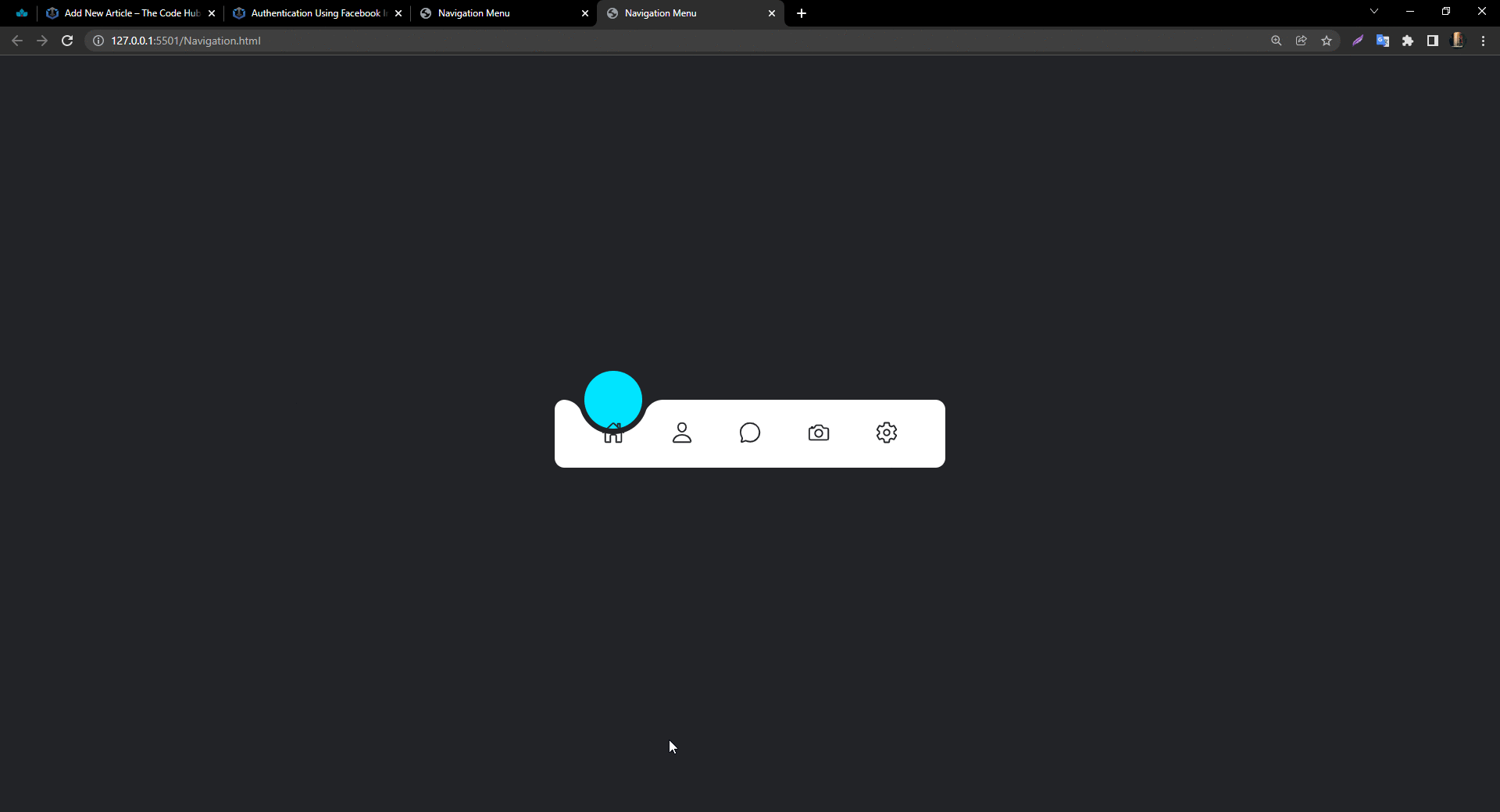
Open your page into the browser and see the result your animated navigation bar is ready
Here is one more important thing don’t forget to add the default active option into your HTML code
Add “active” class into your ‘li’ tag which you want to get default selected when you load your page.

That’s it.
Now open your page into your browser ad see the result you get your page looks like this :

Here we use the ‘~’ selector in our CSS to give animation to our round indicator .this selector is called element1~element2 selector
Definition and Usage
The element1~element2 selector matches occurrences of element2 that are preceded by element1.
Both elements must have the same parent, but element2 does not have to be immediately preceded by element1.
CSS Syntax
element ~ element {
  css declarations;
}
Summary
Here, we created a simple page for animated navigation bar using normal HTML, CSS, and javascript and the main part is we make this animation without using any keyframe property. we make this using only javascript click event and ‘~’ CSS selector.
You can get more information about element1~element2 selector(~) from Read More
Thank you.