
In this article, we will learn how we can display image in responsive device using cloudinary plugin.
Before that we will take an overview of what is cloudinary. It is a plugin which help us to transform our images based on the device. There are many other functionalities which is provided by this plugin, we use the media optimizer one. You can check the media optimizer cloudinary products here Media Optimizer: Digital Media Optimization – Automated (cloudinary.com)
Let’s Start by creating an account in cloudinary. It has a free signup. Once you login into the system, we can upload the image by creating new folder under the media library option from the menu
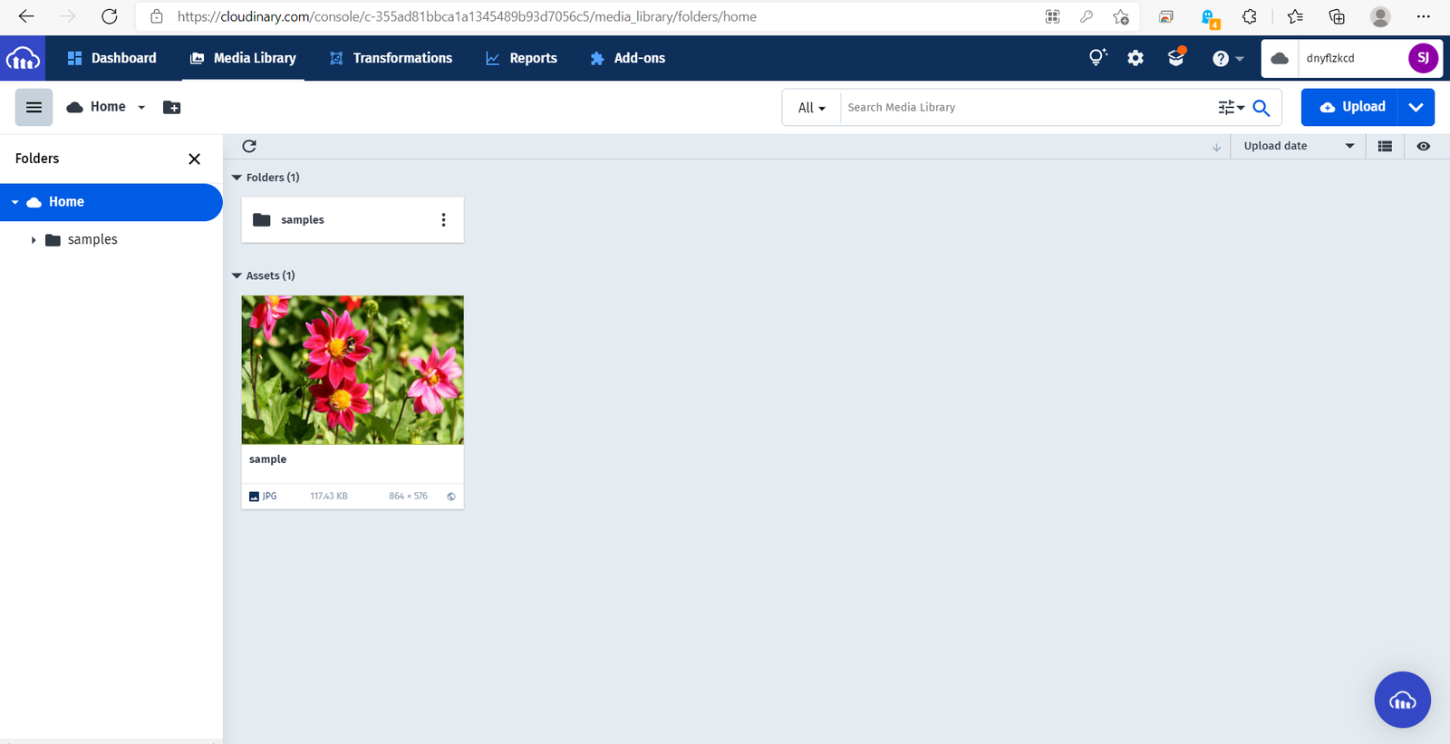
We can upload images using the upload button from the portal or using the API provided by Cloudinary. You can check the blog here How To Upload Images Using Cloud nary In ASP.Net MVC – The Code Hubs to upload the image using c#
Once we upload the image we need to add it html like below. Also, we have to add the js file given by cloudinary.
<!DOCTYPE html>

<html lang="en" xmlns="http://www.w3.org/1999/xhtml">
<head>
    <meta charset="utf-8" />
    <meta name="viewport" content="width=device-width,initial-scale=1.0" />
    <title></title>
    <script src="https://unpkg.com/cloudinary-core@latest/cloudinary-core-shrinkwrap.js" type="text/javascript">
    </script>
</head>
<body>
    <div style="width:50%">
        <img alt="sample" style="width:100%" src="data:image/gif;base64,R0lGODlhAQABAAAAACH5BAEKAAEALAAAAAABAAEAAAICTAEAOw=="
             data-src="https://res.cloudinary.com/dnyflzkcd/image/upload/w_auto,f_auto,q_auto/v1627121827/samples/food/dessert.jpg"
             class="cld-responsive" />
    </div>
    <script type="text/javascript">
        var cl = cloudinary.Cloudinary.new({ cloud_name: "dnyflzkcd" });
        // replace 'demo' with your cloud name in the line above
        cl.responsive();
    </script>
</body>
</html>
Note: cloud_name is the name of the cloud of our account. we can find it in the portal next to the profile icon.
We have to add the cloudinary image url as data-src. To make the image responsive as per the device, we need to add width as auto. For that, we added w_auto in the url.
To manage the quality of the image, we use q_auto and f_auto is to handle the image format. For optimization of image format and quality matter a lot.
Here is the video for the result